
A couple of weeks ago I was in Plymouth for the Society of Cartographers Annual Conference. Lots of interesting talks and a fun and friendly atmosphere, particularly during the evening entertainment: pub quiz, boat trip and rum cocktails. [update: forgot to say my photos from the conference are here]
I came across a strange new breed of people who knew all about making maps using only adobe illustrator. That’s a side of “cartography” which rarely surfaces at the geo events I’ve been to before (and I’ve been to quite a few now), but this seems like a rather interesting artistic end of a map-making spectrum. I didn’t come across anyone who had tried out OpenStreetMaps options for exporting to Illustrator. This probably needs to be made easier, but I suspect Maperative might be a kick ass tool in this arena. I don’t have illustrator myself, so I’d be interested to know how well it works.
I gave a talk on a blend of topics to do with transport and open data and some of my experience of mobile geo development. I talked through some stuff I’ve been working on at placr.co.uk: The UK Travel Options iPhone app, and the more recent placr.mobi mobile website. Then I gave a few more nice bits of bus route related technology (and cartography) coming out of OpenStreetMap.
The slides and notes (approximately what I said in the talk) are included with the presentation on slideshare, or OpenOffice download, or PowerPoint download …or here it all is in good old pictures & text:
Slide 0
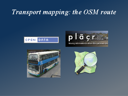
I’ve got four different things I want to talk about.
I want to talk about Open Data, and specifically Open Transport Data. And I want to talk about the work I’ve been doing at placr.co.uk, and finally my hobby and passion OpenStreetMap.
Lots to cover, but fortunately they’re all wonderfully interrelated, so it’s really just one big topic.
Slide 1
So there’s this open data revolution going on, and I believe it can be a revolution.
Data owners are resistant. I think there’s two main reasons. Either they are very directly protecting revenue they get from selling data, or they’re just scared the data (or even just the manner in which they publish it) will make them look bad. But happily Open Data is a political hot topic at the moment so data owners are coming under pressure.
One of the main political arguments for open data, is about transparency and accountability, which we see with datasets such as local council expenses. This is important of course, but I think there’s something quite negative about it. It’s almost like we’re saying “give us your data so we can sit here and more easily complain and criticise”
The second reason is to fuel innovation
Slide 2
Innovations can be enabled by open data, but there’s an awful lot of datasets being published because of this new political pressure. Some of them are quite uninspiring. Some are just a front onto a set of less open more high value data. The more exciting innovations, really useful applications which change our lives for the better, are only enabled by what you might call “high value datasets”.
Transport is an area with great potential for really useful apps. 51 billion passenger kilometres by train in a year. This a big number, although contrast it with 700 billion passenger kilometres by car. We can help change that. I like to think of it on a more personal level. How much of my life have I spent on trains and buses? If we can build apps that make this even a little bit better/easier, then that’s something quite powerful and transformative.
Slide 3
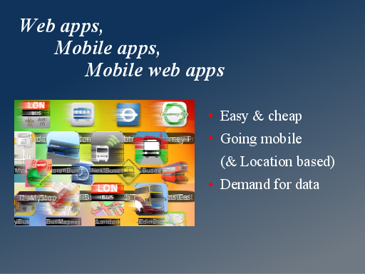
The reason we can talk about innovation coming from small companies and even bedroom coders, is of course that’s it’s very easy to put out applications on the web, and more recently apps for mobile phones.
It’s easy & cheap. This is deceptive though. It’s not that easy or cheap, but there are no up front costs, and people who have the the skills and the time to do it, can produce wonderful results on zero budget. The best results come from people with technical skills but also design flair and a deep understanding of user experience.
Obviously for transport, if we can easily develop for mobile platforms, this lets us put our app in the hands of travellers while they are travelling.
There’s a thriving community of developers and all of this drives demand for useful data.
Slide 4
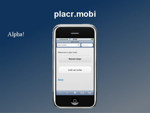
I’m going to show you a mobile web app which we’ve been developing called placr.mobi
Let me say straight away, when it comes to talented app design and useability, I like to to think we’re somewhere on that spectrum, but I appreciate that this isn’t the greatest ever showcase.
We’re very much following the “release early release often approach“, and there’s quite a few glitches we still need iron out in this app, but it is available to have a play with at http://placr.mobi and interestingly one of the test areas we have data for is here in Plymouth!
Slide 5
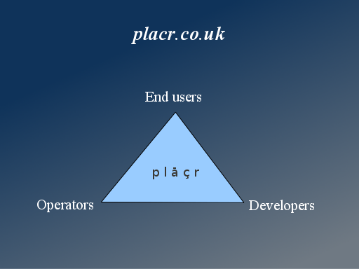
But actually we’re not just in the game of trying build a great consumer oriented mobile app. It’s one of three areas we’re looking at.
We want to help other developers create mobile apps and web services for Transport. Some transport datasets are very awkward to work with in their raw form (I’ll explain more in a moment) We are offering a transport api which makes life easier for developers.
We’re also talking to transport operators and they are showing some interest in the analytics we can do with their data, and the channel we have to developers and end users.
So we’re looking at building apps, and it might allow us to earn some revenue with ads or through charging for a premium version. But it also feeds into the other two strands.
Slide 6
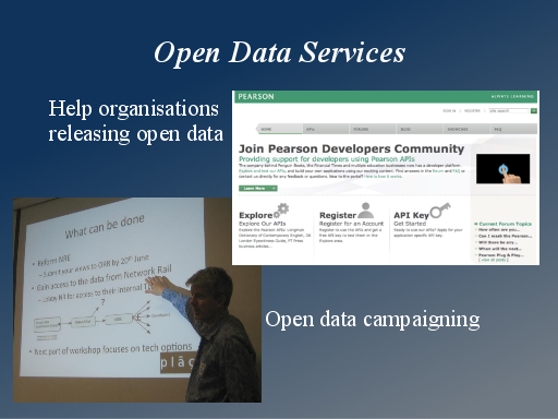
While I’m explaining placr, let’s take a further step back. Placr is an “open data services company”. We work with organisations who need help with releasing datasets.
We’re working with Pearson, the global publishing firm, reformatting their data, developing RESTful APIs, to help them engage the developer community (developer.pearson.com)
Along the way we also do a lot of open data campaigning, particularly my boss Professor Jonathan Raper who campaigns for open data in the highest levels of government.
Slide 7
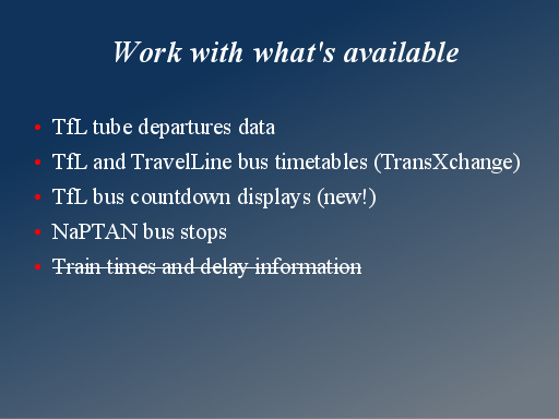
For now though we need to work with what we’ve got. These datasets were particularly of interest to us.
TfL (Transport For London) has departure board displays as HTML, which we’ve scraped, but we were also one of the first people to test out their new API for this.
We’ve parsed their TransXchange files for static timetables.
There’s a brand new countdown display for live bus information released this past week. We will be taking a look at that.
NaPTAN is a dataset of bus stops with locations. This is useful alongside other bus data.
We’d love to do more with train timetable/live data, but this is an area where we’re actively campaigning, because the data isn’t open. ATOC are the open data villains here.
Slide 8
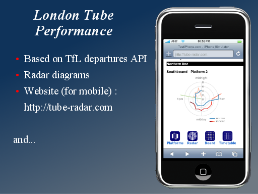
So the first dataset I mentioned was departures. This is data as displayed on the dot matrix screens on tube platforms, showing a train coming in 4 minutes and another train in 7 minutes for example.
We take this and run statistical calculations and averaging to let us create performance stats and displays. You can see these at http://tube-radar.com
Slide 9
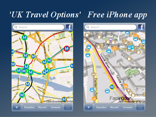
Here’s the first bit of “cartography” I can show you. I can’t really take credit for this. It’s a wonderful map display engine created by a company called Faster Imaging, and available as a free iPhone app “UK Travel Options”. The screenshots don’t do it justice actually. You have to try out the fluidity of the interface and finger gestures for manipulating the map, to fully appreciate this. The map data is OpenStreetMap.
On the left though we see traffic light indicators on the tube stations, based on the performance statistics from placr.
Slide 10
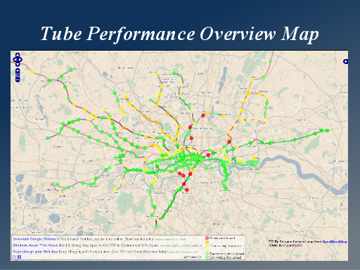
And here’s those same traffic light indicators again on a more basic web map. http://apps.placr.co.uk/transportapi/tube/dashboard
Slide 11
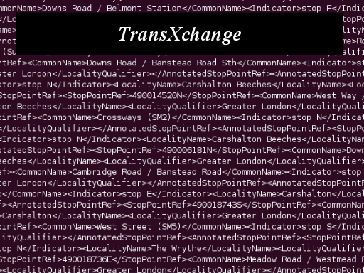
We looked at the dataset for bus timetables from TfL which was in TranXchange format. This is a rather complex XML format which feels rather hairy and bloated for people trying to do rapid development. So I spent a few days trawling through big XML files.
Slide 12
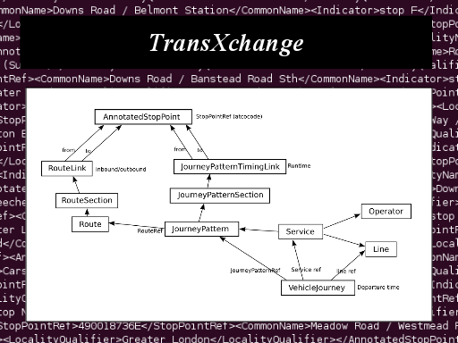
I came up with this diagram of the objects and their links within the file. It seems to be suited to loading into a database, to make sense of these linkages.
Slide 13
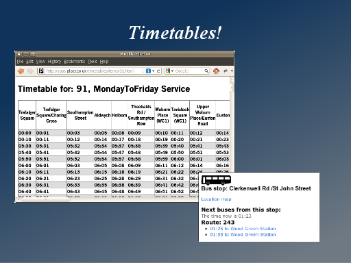
The desired outcome which took an awful lot of data wrangling to achieve… was of course something which looks like a normal timetable.
Once we’d figured out how to get a timetable grid like this, we made some quick progress, loading that data into a database and then into ruby on rails to produce some new outputs. For example here’s a little web display of a bus-stop, showing when the next few buses are departing from the current time.
Slide 14
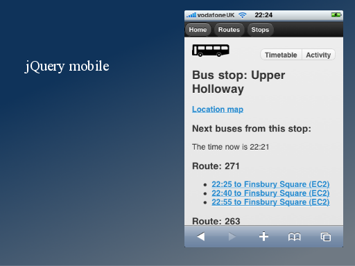
So this is that same content presented within the placr.mobi mobile web app. So we’re parsing the transXchange and providing a content API. This can be easily consumed by mobile app developers.
For placr.mobi we use a javascript library called jQuery mobile, which very quickly and easily makes a website look like an iPhone app. It’s quite nice, but we’re encountering a few gotchas with it.
Slide 15
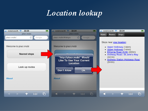
We start to see a geo element to this app when we tie into bus stop location data. So the app lets you find nearby bus stops. We use the web browser location features, which result in this prompt. This will be familiar to iPhone users. Essentially the user has to say that they’re happy for placr.mobi to know their location.
…and then we can list the five nearest bus stops.
When designing simple geo apps, I think its really interesting to think about foursquare. Dont worry. I think it’s a pretty silly game too, but it’s a poster-child of location based mobile apps, and what’s really interesting is that it doesn’t show any maps in it’s interface. It’s a terrible thing to say at a cartography conference, but you can build exciting geo-apps, without showing any maps, and maybe this can help keep things simple and appeal to a wide demographic.
Slide 16
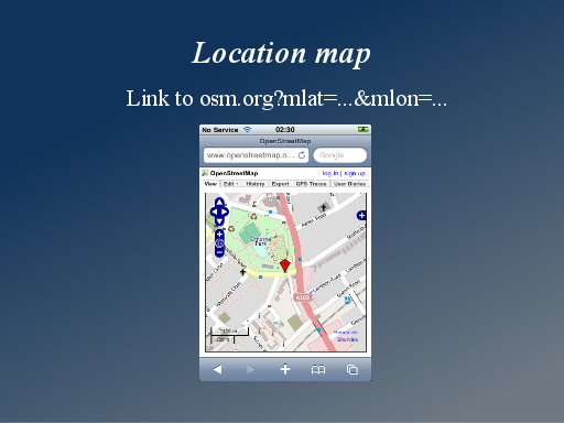
But don’t worry. I love maps just like the rest of you, and in fact I couldn’t resist putting some maps into the app.
This is an easy thing to do. If you’re developing a web or mobile app and you have a lat/lon in your database, just drop in a link to OpenStreetMap.org You can pass the lat/lon as parameters. Use the ‘permalink’ feature to see how the URL should look, but then you can also add a marker by changing the url parameters to mlat and mlon.
This is an iPhone screenshot, and you can see that the map fits nicely in the browser due to some custom mobile css. However the OpenLayers library used, doesn’t allow pinch zooming
Slide 17
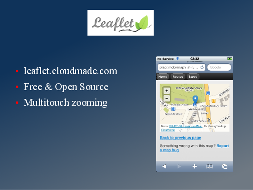
So I’ve started looking at using another javascript library called ‘leaflet’ from CloudMade. It’s free and open source, and you don’t have to use it with CloudMade tile servers, so they’re not trying to create any lock in, which is cool.
And this does allow pinch zooming.
Slide 18
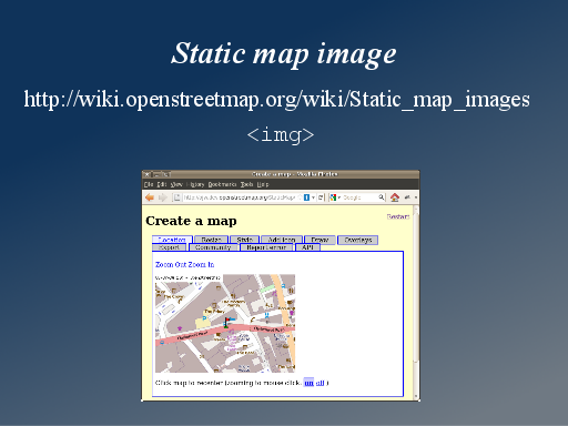
But here’s another simplification to think about. Static map image APIs allow you to just use a plain old img tag in your HTML. This is perhaps the ultimate map display solution for cross-browser mobile compatibility.
The src URL of the img tag has all the location and size parameters. One thing to watch out for with this is that you’re very dependant upon another server somewhere generating these images.
Slide 19
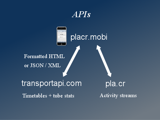
So we’re working with transport related open data and building a transport API at transportapi.com. We’re doing some JSON/XML stuff, but also content APIs, so formatted HTML fragments which are then taken by placr.mobi and other app developers to be displayed.
Looking at placr.mobi you’ll also see some stuff to do with activity streams, and a short URL service pla.cr I won’t talk much about that now, but essentially we’re doing some experiments with social networks and social engagement with and between bus travellers.
Slide 20
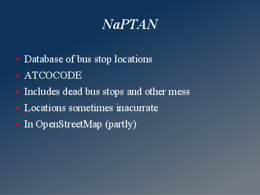
NaPTAN is the bus stops dataset. It’s quite well organised in that every bus stop in the country has an atcocode. It does include a lot of closed/discontinued bus stop locations which you have to watch out for, and the locations are a little inaccurate.
OpenStreetMap has imported NaPTAN bus stops in some parts of the country.
Slide 21
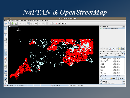
This might amuse you. I sometimes manipulate or view geo datasets by converting them to .osm files and then opening them in JOSM, the Java OpenStreetMap Editor. This is what happens when OpenStreetMap people try to be GIS people.
I can do various comparisons this way, but what we see here is the OpenStreetMap bus stops in the south west, and highlighting in red those which have been imported from NaPTAN.
Slide 22
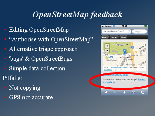
The interesting thing about taking this data from OpenStreetMap, is that OpenStreetMap contributors can make improvements, so in particular it could be good to encourage people to refine the accuracy of bus stop locations.
It is possible to develop editing functionality within mobile apps. Users can “authorise with OpenStreetMap” via the oauth mechanism of the API. This is complex in terms of development, and also in terms of user experience.
Another way which I think lots of mobile app developers could think about, is to follow a triage approach. There’s a database of map bugs called “OpenStreetBugs”. Users can very easily (with a simple interface) report problems, but OSMers need to make the actual edits later
In a simple mobile app it may be a challenge to explain that OpenStreetMap data should not be copied. Also smartphone GPS accuracy is not good enough for placing OSM nodes
Slide 23
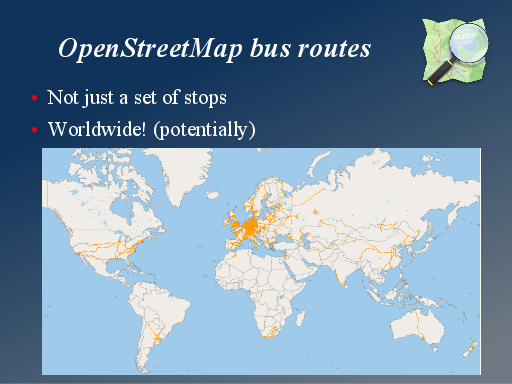
We haven’t delved into this much with our placr work so far, but OpenStreetMap does have bus routes data. It’s not complete but the more people use the data, the more motivation there is for the community to fill it in. A great thing about working with OpenStreetMap, is that your service has the potential to be worldwide. If you get something working well in the UK, it can work just as well in New Zealand, or even in the developing world. Wherever local people have filled in bus routes data.
Slide 24
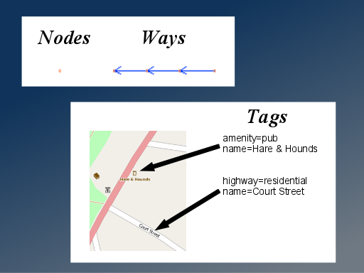
When I’m introducing OpenStreetMap I generally explain how the data is made up of Nodes and Ways, and these have tags on them. And this data model is wonderfully simple.
Slide 25
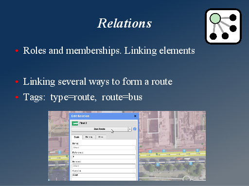
However for working with bus routes I need to introduce another datatype: “Relations”. Basically these things relate different nodes and ways in some way, and they also have tags. But they can make things a bit complicated
But we can use them to represent a bus route with a relation made of roads, with the tags type=route, route=bus.
Slide 26
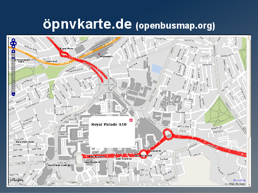
And we can render these bus routes on a map. Here we are in Plymouth. We can see that there’s quite a few missing bus routes here. Maybe we should do a mapping party later!
This is öpnvkarte.de, a very german website with an umlaut in the domain name, but you can also reach it via openbusmap.org It’s been around for a while, and it’s one of the nicest examples of OpenStreetMap custom map styles. It looks great at the higher zoom levels too. And there’s some interesting dynamic clickable bus-stop features on this site too.
This site was having some some server instability, and wasn’t showing OpenStreetMap updates. This thing of bringing in updates is really important as a way of spurring the OpenStreetMap community to add in more. Happily the site is now working well
Slide 27
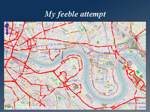
But during a period when it was failing to update, I was motivated to come up with my own attempt. I wanted to see how the london bus routes coverage was progressing. So here’s my mapnik rendering, which I did as a one-day “hack” at a rewiredstate event.
Slide 28
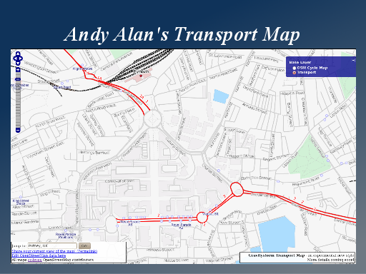
But this was quickly redundant because shortly after I did it, Andy Allan launched this transport map.
I believe Andy presented at the Society of Cartographers last year. This is his new transport map. Again some really nice cartographic styles. He’s gone for simple thin streets and dropped a lot of detail to highlight the bus routes.
You can see this on http://opencyclemap.org if you flip to this alternative layer in the top right.
Slide 29
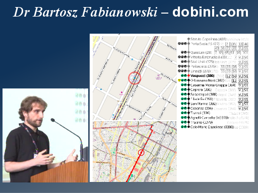
I didn’t make it along to the OpenStreetMap conference in Vienna unfortunately, but you can see video of the talks. There was an interesting presentation from Dr Bartosz Fabianowski of dobini.com http://sotm-eu.org/talk?62
He’s done some interesting work, again using Mapnik, but just rendering small images alongside strip diagrams for print display at bus stops. He has an emphasis on automation, so this whole display is generated automatically from the raw data.
Slide 30
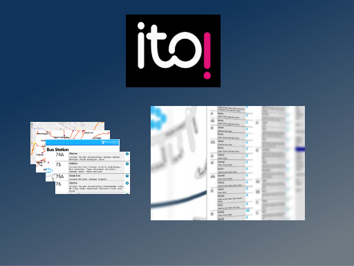
And of course I have to mention our sponsors at this conference. Itoworld are doing some good looking stuff around bus timetables and maps, also creating print output. It’s a little bit hidden behind the scenes, but the sample images on there site look impressive.
Slide 31
Thankyou for listening. Here are my contact details, and you can try out the app I’ve been describing by browsing to http://placr.mobi on a smartphone, or just on a desktop P.C.
And of course… check out http://OpenStreetMap.org
Jump links: 0, 1, 2, 3, 4, 5, 6, 7, 8, 9, 10, 11, 12, 13, 14, 15, 16, 17, 18, 19, 20, 21, 22, 23, 24, 25, 26, 27, 28, 29, 30, 31