We had the annual “State of the map” OpenStreetMap conference a month ago. This was in Denver. I had a choice between this or the more sensible carbon-efficient location of Vienna for SOTM-EU a few months earlier. I decided to go to Denver. To be honest I sort of drifted into that decision in a disorganised manner, but I did have some reasons as I said at the time.
I knew there was a core of London OSMers who were deciding to go to SOTMEU, and not to Denver. I felt it might be important to be in Denver as a representative, to meet, explain, and be an ambassador for the heart and soul of OpenStreetMap. The “OpenStreetMap way” as I see it. This is what I tried to do with my talk: “Blossoms, weeds and blades of grass: Growing the map”
The following is all the slides and a transcript of roughly what I said (or intended to say) It’s a bit of a whopper. Sorry if your RSS reader just blew a fuse. Alternatively you can watch this as a video showing slides and good quality audio, or a live action video from the front (but not so good audio). You can also see the slides on slideshare, download for OpenOffice, or powerpoint (32 MB).
Slide 1
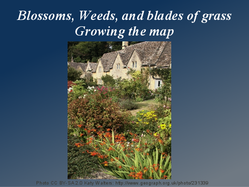
I’m Harry and I’m from England… and I thought I’d compare OpenStreetMap to an english country garden.
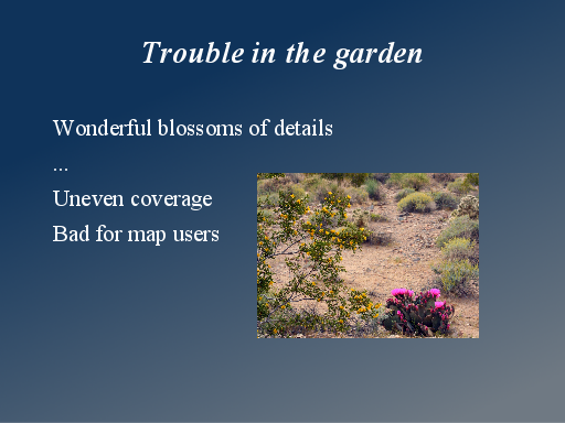
It sort of blossoms with a wondrous variety of shades and colours. I’ll show you what I mean.
Photo CC BY-SA 2.0 Katy Walters: http://www.geograph.org.uk/photo/231339
Slide 2
As we started the map in the beginning…
http://wiki.openstreetmap.org/wiki/London_mapping_party_Jan_2007
Slide 3

…it was like crocuses pushing up their heads in the early spring.
Photo: Frühlingsblumen Krokus by Benjamin Gimmel, CCBYSA 2 etc on wikimedia commons: http://commons.wikimedia.org/wiki/File:Fr%C3%BChlingsblumen_Krokus.jpg
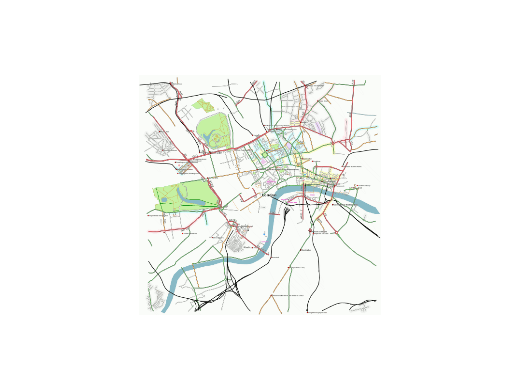
Slide 4
Somebody mapped the whole of Cambridge…
http://wiki.openstreetmap.org/wiki/File:Cambridge-2007-01-18.jpg
Slide 5
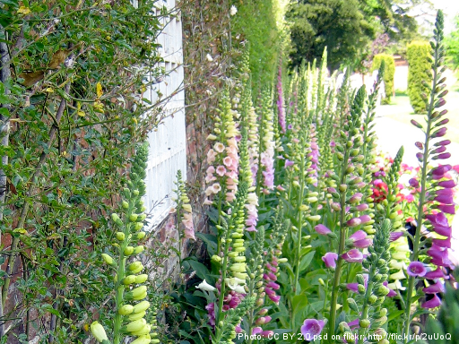
…the towering foxgloves of Cambridge
Photo: CC BY 2.0 psd on flickr: http://flic.kr/p/2uUoQ
Slide 6
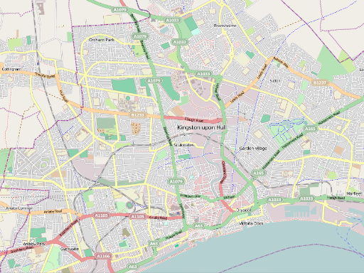
All of Hull was mapped by one person in glorious detail…
Slide 7

…blossoming like beautiful marigolds
Photo CC BY-SA 2.0 mariosp on flickr: http://flic.kr/p/8A1DsY
Slide 8
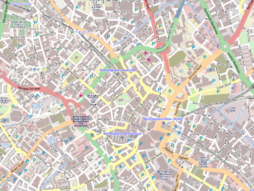
The collaborative mapping of Birmingham…
Slide 9

..is like a bunch of forget-me-nots
Photo GFDL/CCBYSA3 Quadell on wikimedia commons: http://commons.wikimedia.org/wiki/File:Wald_Vergissmeinnicht.jpg
Slide 10
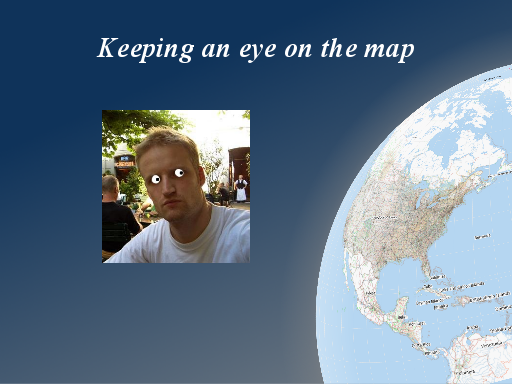
Sometimes I like to imagine I’m managing to keep a watchful eye on the map, and seeing how it develops worldwide.
This is nonsense, because the map is big, and the community of mappers is big. I really love it when I look around the map and come across things which surprise me.
Image from the flyer by Frederik Ramm: http://svn.openstreetmap.org/misc/pr_material/english_flyer_2010_10/marble_new_shadow.png
Slide 11
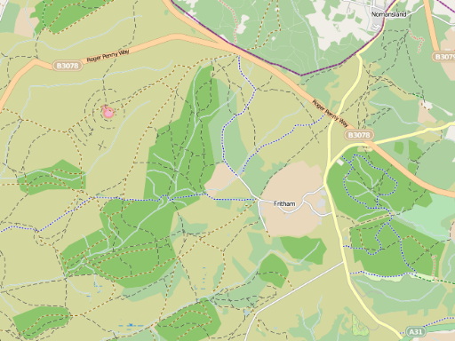
A couple of weeks ago I was just casually panning around somewhere in South England and I came across this glorious patch of detailed countryside mapping.
Slide 12
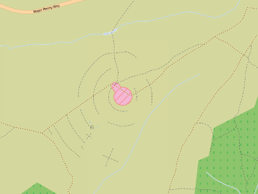
And what’s this pink thing with circular footpaths around it? I don’t know. I have never been there! It’s a wonderful and surprising patch of detail to encounter. Somebody clearly feels passionate about the map of this area.
Slide 13
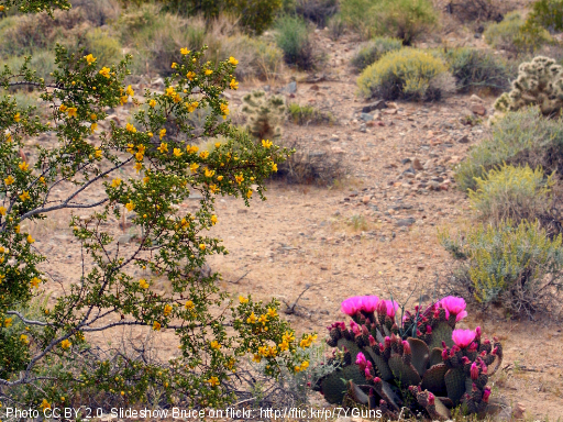
So these blossoms appear by surprise. Perhaps it’s more like blossoms in the desert, appearing from barren desert floor, when the conditions are right.
Photo CC BY 2.0 Slideshow Bruce on flickr: http://flic.kr/p/7YGuns
Slide 14
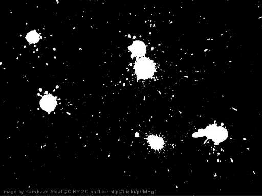
Or like splats of ink
Image by Kamikaze Stoat CC BY 2.0 on flickr http://flic.kr/p/rMHgf
Slide 15
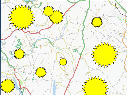
….or perhaps like bombs dropping. But mappers don’t drop bombs of destruction, they’re dropping map bombs. An explosion leaving behind a circular areas of map coverage near where they live or work.
I think the way the community builds the map is a glorious and fascinating thing to behold, and utterly unique to OpenStreetMap.
Slide 16
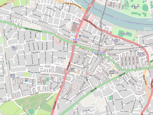
We see a similar thing within an area like London, where we have a backdrop of “complete” coverage in terms of having all the roads and basic features in place, but now we get these patches of mega-detail blossoming with every building drawn in., and lots of POI detail added.
This is all good fun, and part of the same wonderful blossoming of map detail, but I am going to come back to talk about problems particularly related this kind of example, a little later on.
Slide 17
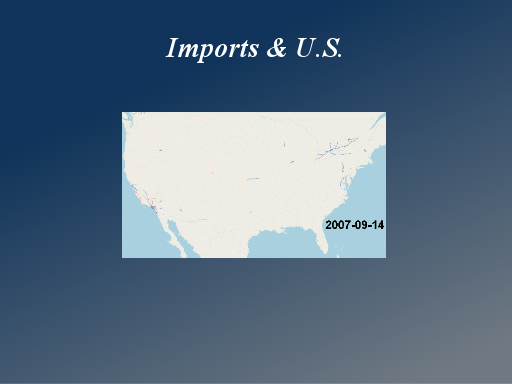
I want to compare that situation with another type of map growth, which is more relevant to the U.S. Here we see a lot of data imports. In particular we see TIGER data across the whole US which has really shaped and characterised OpenStreetMap here ever since it was imported
http://wiki.openstreetmap.org/wiki/TIGER
Slide 18

TIGER gives us even coverage. Perhaps like a nice flat garden lawn.
Photo CC BY-SA 2.0 AdamKR on flickr http://flic.kr/p/7SkGUP
Slide 19
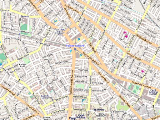
And then there’s more detailed imports in some areas of the U.S. This Is MassGIS
http://wiki.openstreetmap.org/wiki/MassGIS
Slide 20
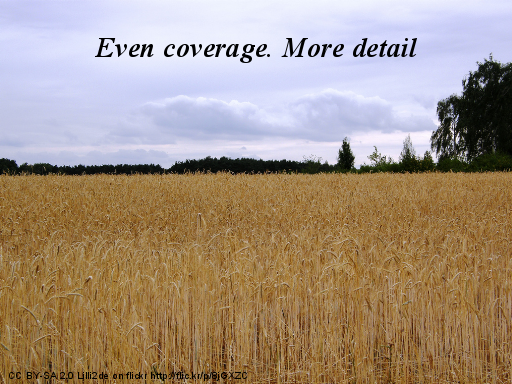
Perhaps more like a field of corn. There’s even coverage but none of the exciting blossoms of coverage coming from passionate local mappers
Photo CC BY-SA 2.0 Lilli2de on flickr http://flic.kr/p/8jGXZC
Slide 21
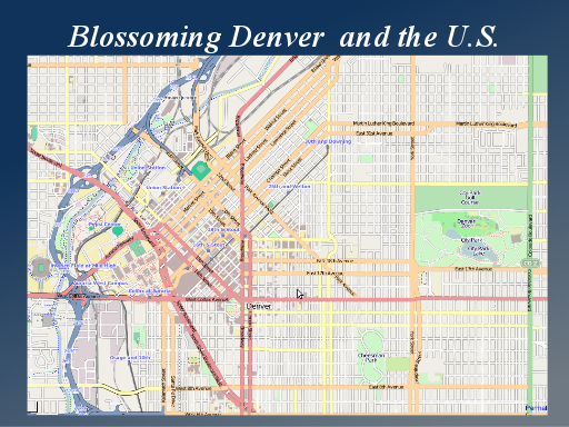
It would be unfair to say there are no blossoms in the U.S. In fact here in Denver we see some great details appearing, and as I keep an eye progress here I’m seeing more and more of this kind of mapping starting to pick up in the U.S.
Slide 22
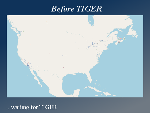
Before TIGER was imported there really wasn’t very much data in the U.S. and the community wasn’t progressing well, but there was always a lot of talk about the TIGER data, and perhaps the community was in some sense waiting for TIGER. Perhaps the proactive tech-savvy folks who we need as community leaders, were aware of the pre-existing free data
http://random.dev.openstreetmap.org/progress/?region=northamerica
Slide 23

But after the tiger import, with all this new data in place, the growth of the U.S. community was still slow, and this caused people to start speculating and theorising about the negative effects of imports.
There was an imports panel at the Vienna conference a few months ago. I’m going to borrow some slides and quotes from this.
Slide 24

“The best imports are those we avoid” was Frederik Ramm’s summary. Matt Amos said “Imports bad. Surveying good” Actually that’s not really a quote. That was his suggestion for my entire slideshow.
So some fairly strong anti-import opinions.
Slide 25
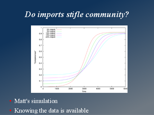
This is also from Matt. A few years ago he ran some simulations showing how the map completeness progresses, taking into account new users arriving, and running out of areas to map as it gets more complete.
It shows that if we start from nothing, but build up momentum and growth we actually end up getting better map coverage quicker than if we start with a certain amount of imported data.
Obviously it’s just a simulation, and with different parameters it would follow a different line. Also it doesn’t take account of this effect of people waiting for an import when they know the data’s available.
Slide 26
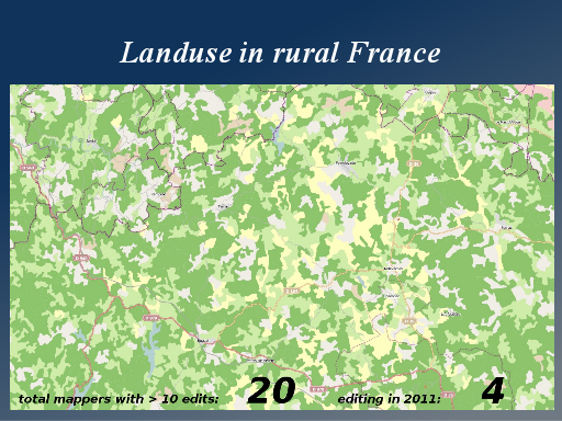
Frederik showed this example of an area of rural France where there’s been an landuse import. As you can see the map looks quite rich with data, but if we count up the number of users editing, there have been 20 users editing in this area since the import, and only four in the past year.
Slide 27
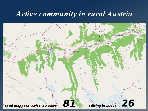
He compared this with an area of the same size and the same population in rural Austria. Here we see a much more active community. 81 users editing, and 27 users in the past year. And the map is an expression of local interest and passion.
Slide 28
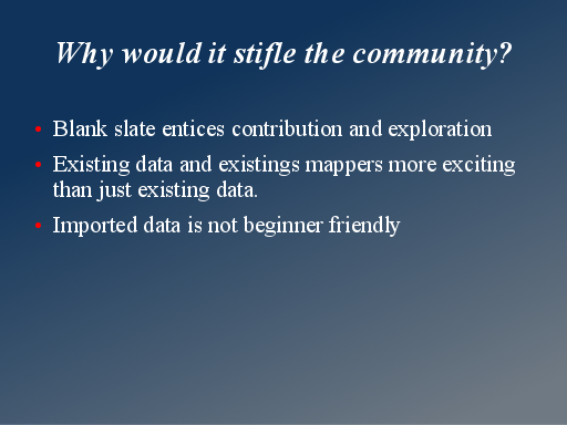
But why would an import stifle the community in this way? The usual theory is that a blank area of the map entices and excites people. It feels like exploration to go and map an empty area.
But here’s a different theory. Often imported data is just not very beginner friendly.
Slide 29
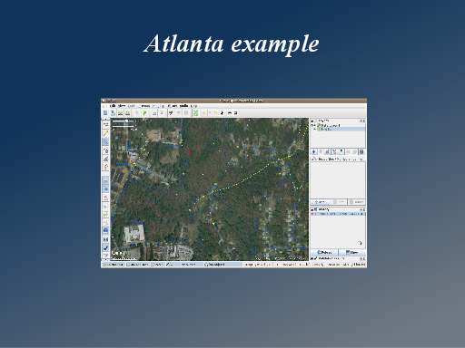
I thought I’d show you what I mean with an example in Atlanta. [Demo] Atlanta has imported TIGER data, but also an import of some landuse data. There’s been a little bit of mapping activity in the city centre, but if we zoom in here http://osm.org/go/ZQqo7cqLm- a little way out from the centre, there’s a patch of woodland. I can bring in the bing imagery and just straighten this out a little bit.
As an experience user I know that this is imported data with limited accuracy, and I have the confidence to plough in and make some improvements. For new users this is difficult, and that’s before you consider that we’re dealing with ways on top of ways which are fiddly and technically difficult to make sense of.
I can also see some NHD data which has many nodes, but clearly isn’t very accurate.
Slide 30
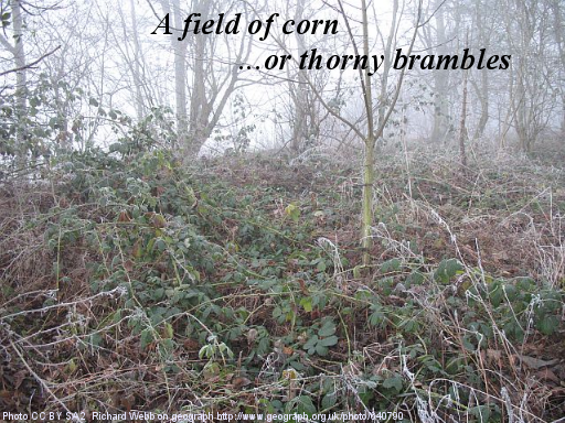
So for new users this is less like a field of corn and more like a thorny patch of weeds or brambles.
Photo CC BY SA 2 Richard Webb on geograph http://www.geograph.org.uk/photo/640790
Slide 31
Here’s another quote from Frederik. I think this is a great way of putting it.
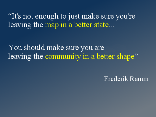
“It’s not enough to just make sure you’re leaving the map in a better state…” If you’re running an import you may imagine that you’re doing a good thing provided the map ends up being better.
But “You should make sure you are leaving the community in a better shape”
Slide 32
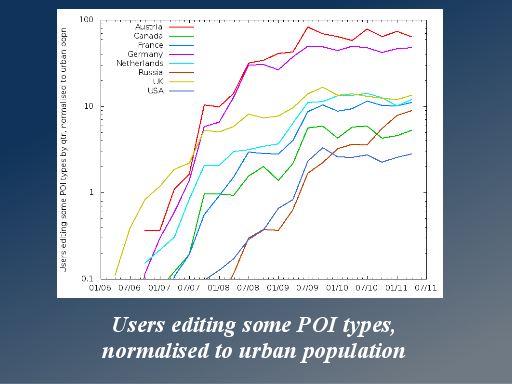
Here’s some more analysis from Matt. This shows the growth in number of different users editing POIs normalised to population.
Germany and Austria rank highly. We know they have very strong mapping communities.
The U.S. comes in last.
Interestingly the Netherlands scores quite well. They imported the whole country , but it seems they’ve still managed to build a strong mapping community.
Slide 33
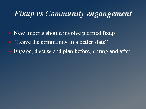
I’m going to talk about fixup. I don’t want to give the wrong idea. If you’re doing an import you should not be dependant upon users manually fixing up the mess you’ve made afterwards. Or if you do need a manual fixup phase, this should be planned and discussed before during and after the import.
Slide 34
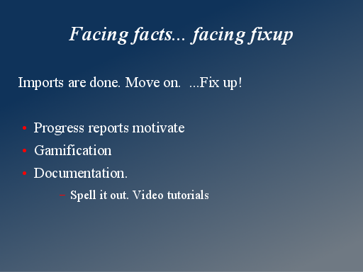
But with existing imports, particularly the massive TIGER dataset, there’s no point dwelling on whether or not the import was a good idea. We need to move on and think about fixup now. This is the big challenge in the U.S.
There’s been a lot of talk at the conference about ideas for encouraging more mapping. When it comes to doing this in the U.S. we’re talking about encouraging fixup.
Slide 35
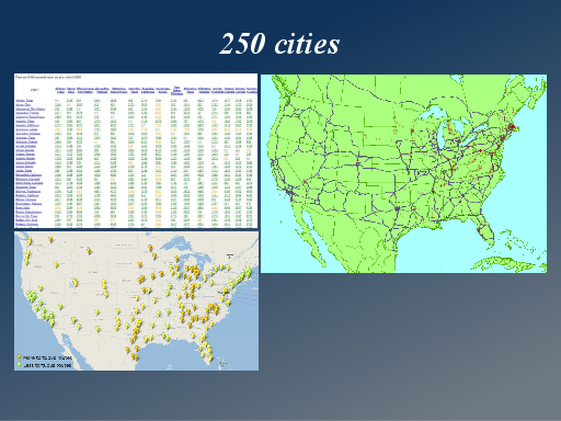
While we had our team at Cloudmade in 2009, we set up the “250 cities” project which looked at encouraging fixup with a focus on basic routing in the US.
http://wiki.openstreetmap.org/wiki/TIGER_fixup/250_cities
Slide 36
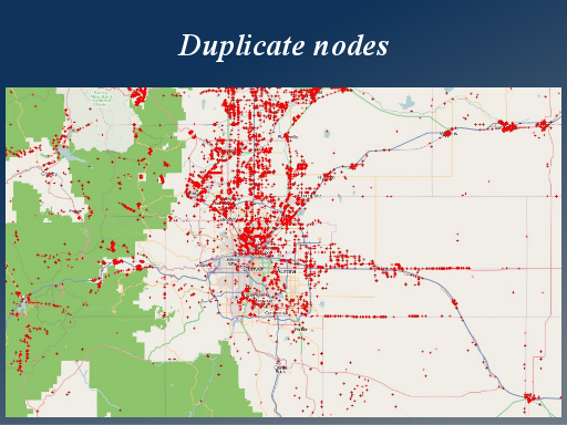
Most routing disconnects are actually caused by duplicate nodes. Nodes sat directly on top of eachother. These need fixing all across the U.S., and the duplicate nodes map lets us see the progress with this.
There’s some confusion around this. Let me be clear: Yes, we should fix the duplicate nodes, and no, we shouldn’t do it automatically
http://matt.dev.openstreetmap.org/dupe_nodes/
(Note this is broken/unreliable at the moment due to problems with OWL)
Slide 37
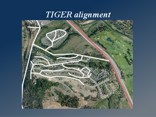
Also a widespread problem with TIGER data is the general positional accuracy. This is a display we created as a tutorial resource. I can flick between before…
Slide 38
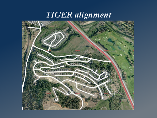
…and after. To show the kind of corrections we need people to make. Just simply dragging the roads into the right positions using the aerial imagery. It varies from one patch to another, but there are a lot of patches of TIGER data which are wildly inaccurate in this way.
Slide 39
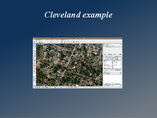
I can show you a quick example of this in Cleveland (Tennessee) where this kind of fixup is needed and hasn’t happened yet.
Note: I skipped over this demo to save time. At time of writing there is still some good juicy TIGER alignment fixup to do here: http://osm.org/go/ZQ6IJ2qF- I would expect this example to get fixed some time soon, but there will be other similar pockets for some time to come.
Slide 40
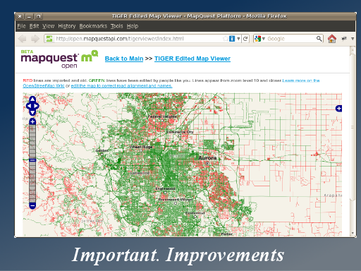
To measure the progress of this we have the TIGER edited map, showing in red any areas which have never been edited since the TIGER import, and green for those which have.
This kind of thing really should receive more attention from the U.S. Mapping community, and perhaps also from developers working to make improvements (it doesn’t work perfectly).
http://open.mapquestapi.com/tigerviewer/
Slide 41
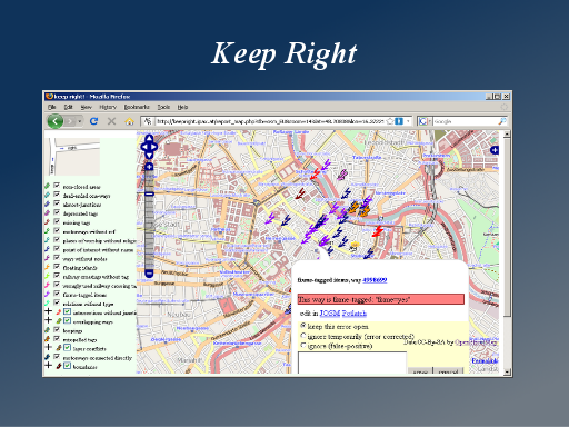
Likewise the keepright tool has an excellent array of automated checks built into it. It discovers all sorts of problems with the TIGER data. Again this should be brought to the attention of U.S. mappers more, but I think there’s various ways the tool could be developed to make it more compelling for mappers.
Slide 42
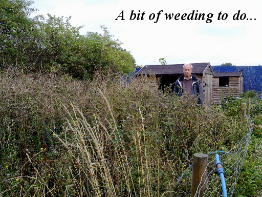
So it’s fair to say that in the U.S. we’ve got a bit of weeding to do, to tidy up the TIGER data.
Photo CCBYSA2 Gordon Joly : http://flic.kr/p/aoj2ij
Slide 43
But if we look back at the situation in countries like the U.K, where we have grown our map organically, I want to talk about a different set of problems in relation to this.
Local passionate map coverage appearing in blossoms is wonderful, but we often have a problem of uneven map coverage. This is an acute problem for map users.
Slide 44
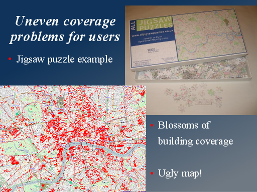
My favourite example of this is my jigsaw puzzle. I got a jigsaw puzzle printed with the map of London on it. I wanted this to be a good clear complete map image from OpenStreetMap.
But the London map has patches of building coverage, some arranged logically in the centre working outwards, but many patches sporadically appearing as blossoms of passionate building mapping around the outskirts.
Building coverage is quite prominent in the default rendering. This illogically arranged data actually makes the map of London quite ugly and not good for map users. Knowing how to do so, I was able to use a rendering with the buildings switched off, but in general sporadic blossoms of detail can make the map uneven and difficult to use.
Slide 45
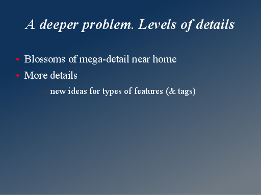
I think this points to a deeper problem. Perhaps one of the trickiest problems facing OpenStreetMap as we work towards a “complete” map.
Mappers are working on their blossoms of mega-detail near home and work, and applying different ideas of what “complete” means. The level of detail we go to is a tricky question.
Slide 46
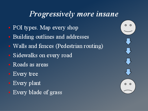
There’s no real limit to the level of detail, because of the way we’ve framed our mapping process with the opportunity to flexibly invent new tags.
Tagging ideas are open to progressively more insane levels of detail. It’s a sliding scale. I regard things like mapping sidewalks and roads as areas, as rather crazy, but people are seriously talking about more and more detail.
Soon we’ll be talking about mapping every blade of grass
Slide 47
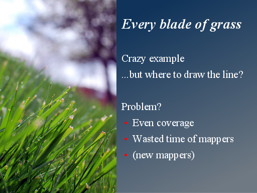
Of course this is taking things to silly extremes, but where do we draw the line?
The usual response to these kinds of concern, is to say “why is it a problem?”. People map crazy levels of detail, and we all have a good laugh about it. It’s a problem because its a waste of time and energy of the mappers doing it, but It becomes more a problem too when people encourage others (including confused new mappers) to follow their lead. This happens within the tagging proposals and documentation, and also blogs and other communication channels. More mappers mapping more and more crazy levels of detail.
Image: CCBY2 meddygarnet: http://flic.kr/p/7YZzim
Slide 48
I don’t have a solution to this problem, and as I say, I do think it’s a big problem we’ll be facing more and more.
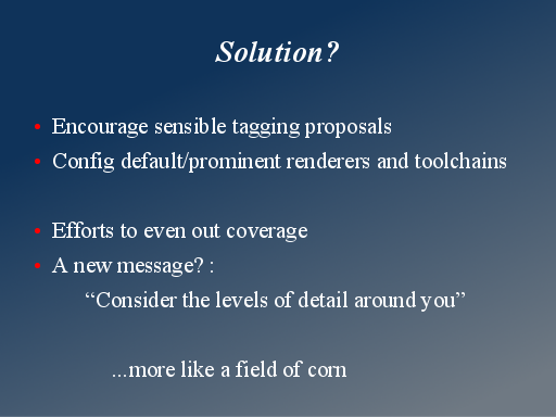
This runs quite contrary to the way we’ve celebrated detailed mapping in the past, but perhaps we need to think about a new message. Among our pro-mappers perhaps the message should be: “consider the levels of detail around you”. Don’t go crazy with the levels of detail within your blossom of map coverage. Keep a cap on this and map further afield instead. Go to a level of detail which is realistically attainable by you, or with the help of other mappers, across a wider area.
It’s almost like we’re trying to make our coverage more like an even field of corn…
Slide 49
So we’ve got problems. Two sets of problems really.
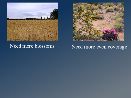
Here in the U.S. we want to see more blossoms of detail created by passionate local people. We’ve got a lot of a fixup work to do, and we need to attract a community behind the data to take on this task
But where we’ve grown our map organically, it can be like blossoms in the desert. We need to find ways of creating a map with more even coverage between the blossoms.
We need to work towards something more balanced, more gentle and serene. Something more like…
Slide 50
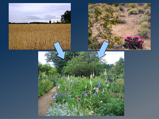
…an English country garden.
Thank-you very much!
Bottom image: Summer Garden, Munstead Wood CCBY2 sarah from gardenvisit.com :http://flic.kr/p/6zbGiw & http://www.gardenvisit.com/garden/munstead_wood_garden
Jump to slide:
1, 2, 3, 4, 5, 6, 7, 8, 9, 10, 11, 12, 13, 14, 15, 16, 17, 18, 19, 20, 21, 22, 23, 24, 25, 26, 27, 28, 29, 30, 31, 32, 33, 34, 35, 36, 37, 38, 39, 40, 41, 42, 43, 44, 45, 46, 47, 48, 49, 50
Harry, this is a really interesting talks, thanks for posting the slides and your speaking notes.
I’d like to see some more rigorous academic research on the question of imports helping or hindering “blossoms”. As you point out, there are complicating factors and counterexamples for almost any general point one can make. What we really need to consider is motivation, which I suspect may vary by country and by things such as whether the mapper is in an urban or rural area, whether they cycle or drive, etc.
On uneven coverage and crazy detail, I think you’re right to encourage mappers to think of the community and not just their own fun. The default mapnik stylesheet and some of the more popular custom renders are powerful levers to encourage people to aim for certain levels of detail.
It can equally be used to dampen interest in niche levels of detail. I wouldn’t mind seeing trees drop off that stylesheet, but I do like having that data in the database. If we had editors like the default osm.org Potlatch 2 installation be capable of only showing and editing a subset of features, just as renderers manage, I think that could be a big help. In fact I’d like us to go further, admitting that once basic geometry for buildings and roads and landuse etc. goes in it’s technically very tricky to edit whether or not you have trees and sidewalks, and that tools like wheelmap.org provide a more usable interface for editing properties without changing the underlying geometry.
I love your talk. I’s great that somebody is looking at the bigger picture.
I have already stolen your imagery (simplified to corn field vs. desert blossom) in one of my talks.
Yes forgot to say…. I was talking about U.S. problems imports etc, but towards the end of the talk I was trying to articulate the “level of detail” problem which we discussed a long time ago on poisonous POIs blog post Tom. I should stop giving trees as an example of nutty details because I do quite like them 🙂
If I was making this slide deck again now I may have thought to include your “OSM Inspector” Jochen. It’s another neat tool we should be promoting a little more for use in the U.S., and persuading someone to pay for you to roll it out in the U.S. fully (the routing errors updates) Richard Weait’s done a new tutorial on it. It’s clever the way the little errors are clickable on there.
A really interesting talk. Unfortunately, I was in the other room at that time, I was able to listen to your talk only in the video.
I’m interested on your thoughts on how to encourage new mappers in an area which was well mapped already. Not by imports but by a previous mapper who added a lot of detail.
If we follow the line that imports stifle community growth because there is an impression of completeness and not much contribution is needed. This can also be a concern for well-mapped areas. Getting new mappers to tend the garden can be difficult for well-mapped areas if the original mapper suddenly stopped contributing.
Yeah. Obviously it’s happy kind of problem, but in London I come across a few techy people who said they would have tried editing OpenStreetMap, but it seems to be well mapped where they live and work. That then exerts some pressure towards more detail level. I try to attract newbies by telling them they can join in our central mapping parties because we’ve always got more building outlines and POI details to work on.
Also I remember a funny conversation after the Milton Keynes mapping party. A hoard of London OSMers got on a train to go there and map the city, but we reflected afterwards that actually we weren’t doing a very good job of creating a sustainable community, so maybe this was just as bad as doing an import of Milton Keynes! So now the theory is “mapping discourages mapping” …this gets a bit silly. But certainly its true to say that recruiting new mappers is more valuable than doing mapping (but then it’s difficult to persuade someone to volunteer doing something which you’re not bothering to do yourself)