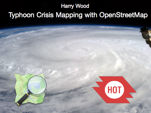
At the Open Data Institute, the office where I’m working at transportAPI these days, they have “Friday Lunchtime Lectures“. Presentations on all sorts of open data topics. It was my honour to kick off the 2014 series with a talk on “Typhoon Crisis Mapping with OpenStreetMap”.
This was an introduction to OpenStreetMap and to the Humanitarian OpenStreetMap Team, and look back our recent crisis mopping work for Typhoon Haiyan.
Thanks to everyone who came along. Thanks for the kind words from attendees from British Red Cross, MSF UK, and MapAction. We shall have to get some follow-up meetings happening! Dan Brickley’s notes capture some of these comments. And thanks to the ODI for organising it, and making this:
Here‘s an audio recording:
Download LibreOffice slides (8.6Mb)
Jump to slide:
1, 2, 3, 4, 5, 6, 7, 8, 9, 10, 11, 12, 13, 14, 15, 16, 17, 18, 19, 20, 21, 22, 23, 24, 25, 26
Slide 1
I’ve been dying to talk about OpenStreetMap at the ODI, because it’s an exciting Open Data topic. But first lets talk about typhoons. This is Typhoon Haiyan seen from the international space statione
Slide 2
I’m not much of a typhoon expert. I tend to think a typhoon is a bit like the weather we’ve been getting in the UK at the moment… only worse
Slide 3
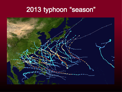
But it is a regular weather pattern in this part of the world. In the Philippines they have a typhoon “season”.
Here we see all the typhoons which happened in 2013. There’s a lot of them. We can also see that they often seem to sort of meander off in unpredictable ways. And all of them start as weak blue lines. Many of them stay that way. A typhoon is a difficult thing to predict.
But this line towards the bottom is Typhoon Haiyan It smashed directly through the middle of the Philippines island chain, bringing a storm surge, and reaching peak category 5 intensity at the time it made landfall.
I’ll just show you a video of what that looked like on the ground: planinternational storm surge video: http://youtu.be/rS0gv4Xbw7w
Slide 4
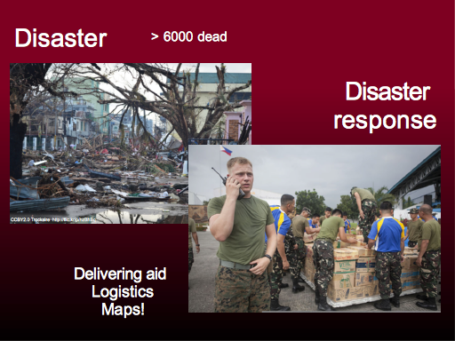
So you can see why a lot of people lost their lives. This disaster killed more than six thousand people. But of course a lot of suffering continues after the initial typhoon, as people find themselves without shelter, food, electricity.
So disaster response is all about aid agencies bringing supplies of food, shelter, medicine, setting up makeshift medical facilities and helping with evacuation. This is clearly life-saving activity, and you can donate money to these good causes to help them do this great work.
But around this there are huge logistical challenges. In a crisis response scenario there can be desperate issues of information and coordination. Very often there is a location component, with all the burning questions beginning “where”. Where are the people in need? Where are the aid supplies arriving? Where are the teams currently situated.
This is why maps can be so important in a crisis
Slide 5
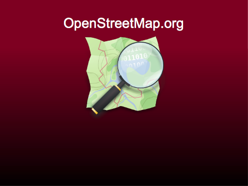
So I’m going to talk about OpenStreetMap.
I’ll do a bit of an intro to OpenStreetMap, but I guess a lot of you will have heard of it. How many people have tried editing OpenStreetMap? (surprisingly most people put their hands up!)
Slide 6
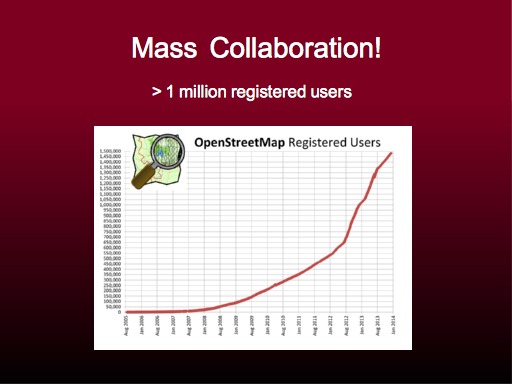
We need lots of people to edit. OpenStreetMap is a “mass collaboration”. We have more than a million registered users. These people can all edit the map.
http://wiki.openstreetmap.org/wiki/Stats
Slide 7
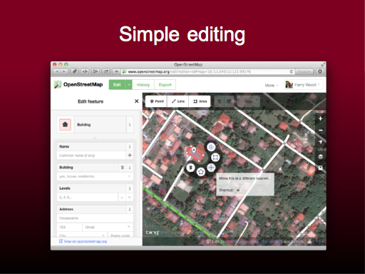
To get lots of people involved we try to make the editing process very simple. It is a form of GIS (Geographic Information System) and it does involve editing vectors, so it’s always going to be a little bit complicated, but we try to simplifying it down as much as possible
Slide 8
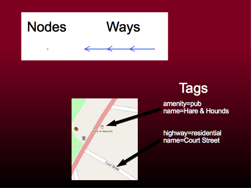
Like the editing software, the underlying Data model is kept very simple.
The map is composed of nodes and ways. And these elements have tags attached to them, to describe what real world feature we are representing.
If you’ve tried using OpenStreetMap data, you may have found tags quite confusing, because they look a bit like “attributes” in a shapefile, but tags are free-form text. They form a folksonomy, in which popular tags are agreed upon and generally used more, but other ideas are allowed within the database.
Slide 9
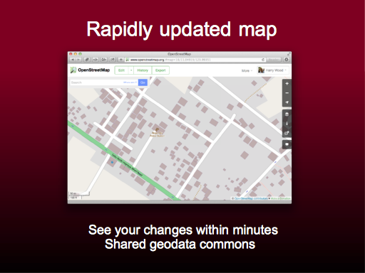
When you make an edit, the change shows up on the map.
We have a map at OpenStreetMap.org Usually I we try to play down the significance of this, because after all there other websites where you can get a good view of a map for free (e.g. one beginning with G)
But this OpenStreetMap “standard” view is significant in crisis response, because we have the technology (no small feat) to allow this view to update in quite a short time cycle. After about 10 minutes you see your changes. This creates a nice reward feedback loop, but it also means that in a crisis OpenStreetMap forms a shared commons for geo-data.
http://www.openstreetmap.org/#map=18/11.04919/123.99351
Slide 10
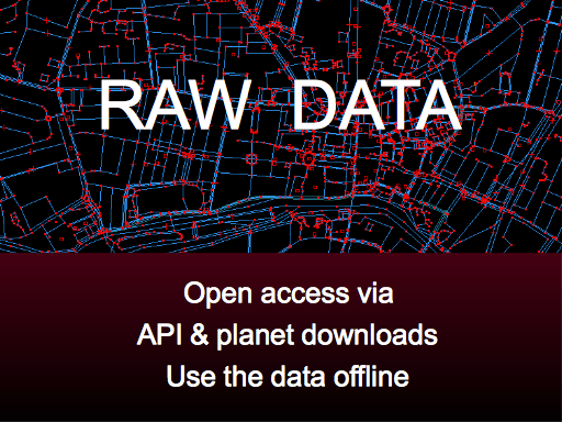
A key area where we score against other map providers, is that we provide all the raw geodata to download in various ways, including a bulk download of the entire “planet” (planet.openstreetmap.org)
This aspect is hugely important although I wont dwell on it too much today.
From a humanitarian point of view it’s useful that people can work with the data offline in an unencumbered way. Offline is important for crisis response where there’s often no internet connection.
Slide 11
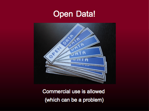
It’s also Open Data! (Licensed ODbL
http://opendatacommons.org/licenses/odbl/summary/ ) I Again I won’t dwell on this, even though this is a hugely important aspect of OpenStreetMap
Interestingly from a humanitarian point of view, we’ve occasionally had issues with our license because we allow commercial use. Talking to humanitarian organisations about sharing their data, often they say they would prefer it to have a “non-commercial” restriction.
Eugh! License fun. I won’t go into details today.
Slide 12
So OpenStreetMap has these various aspects to it. It’s designed with the goal of creating a free open licensed map of the world (which is a good cause!). It wasn’t actually designed with humanitarian uses in mind, but it turns out that these things all make for a powerful platform for disaster response mapping but…
Slide 13
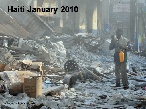
Photo: Agencia Brasil http://commons.wikimedia.org/wiki/File:Port-au-Prince_20_Jan_2010.jpg
…this is something which revealed itself, to the surprise of many people, back in 2010 when the earthquake hit Haiti
Slide 14
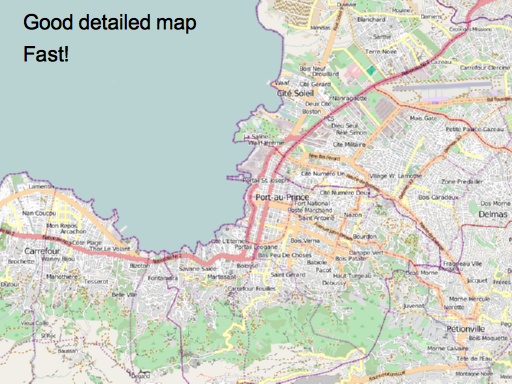
The OpenStreetMap community came together. Everyone had been watching the news, and spontaneously they created a good detailed streetmap, and they made it quickly! The basic streetmap was in place in about 48 hours.
OpenStreetMap suddenly had the best map available for the cities of Port Au Prince and Carrefour. The only map showing all the city streets.
Slide 15
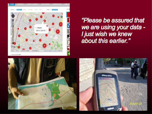
And people used the map.
People used it as a base map, doing the web map “mash-up” thing. This is “ushahidi” layering data on top.
But more importantly, people were using it in Haiti. OpenStreetMap printouts were going up on the walls in the aid agency control rooms, and handed out to people driving aid delivery trucks.
But this is my favourite example. Search and rescue teams used garmin GPS units with OpenStreetMap loaded onto them. As well as being an example from the very sharp end of disaster response, saving lives very directly, it’s also a great example of OpenStreetMap at it’s best: There are open source tools as part of the OpenStreetMap ecosystem, which let you convert raw geodata into the garmin format. The maps are then available entirely offline.
Slide 16
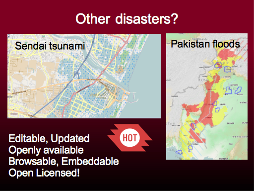
Since haiti there’s a been a few other disasters. They haven’t always been success stories for OpenStreetMap to such an extent as with Haiti because of the characteristics of the disaster.
In Pakistan in 2010 there were huge floods up and down the entire length of the country. The scale of the affected area meant we weren’t able to get good hi resolution imagery, and in general the mapping task was to big.
Here’s Sendai, Japan. Now clearly in a developed country like this there are good maps available already. Same for Pakistan actually.
However there is still some value in crisis response mapping with OpenStreetMap. OpenStreetMap still offers the best way to create an up-to-date map reflecting post-disaster changes, which is readily available and open licensed for whoever may need it.
Slide 17
Since Haiti we’ve formed the Humanitarian OpenStreetMap Team, and got organised in various ways.
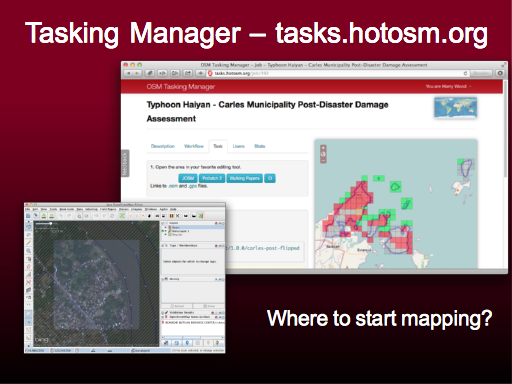
We’ve developed some tools and processes including the “Tasking Manager” at http://tasks.hotosm.org .
The idea is to help new users see an answer to the question “Where do I start mapping?”. It’s also a coordination tool for the community. Mappers click on a square to acquire it, open the area in an OpenStreetMap editor, and click “done” when they’ve finished mapping.
Slide 18
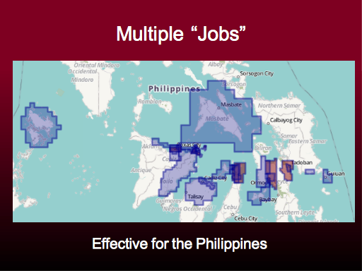
This was used extensively in the Philippines and seemed to be very effective. It was very gratifying to see, not only a software tool working well, but a community process working well, with established rules of etiquette around how to use it. It all felt quite natural and fell into place very well for the typhoon response mapping. This kind of thing is great. It shows that we’re not just scrabbling around chaotically during a disaster. We are practicing and improving. HOT is maturing, and using its collective experience to help cut through the chaos of a disaster.
Here ( http://umap.openstreetmap.fr/en/map/hot-yolanda-haiyan-typhoon-activation_3628#8/11.558/124.887 ) we see the different regions where we placed a “job” grid on the map. Sometimes this was because a partner organisation requested better map data in an area. Sometimes its where we got access to imagery for a particular area.
Slide 19
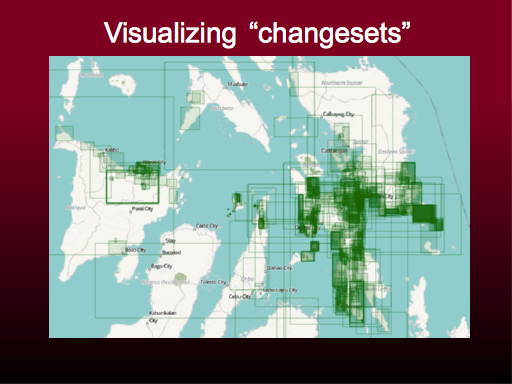
So there was lots of editing activity. Here’s a visualisation ( http://resultmaps.neis-one.org/osm-typhoon-haiyan-2013 ) which starts to show what that looked like. Changeset bounding-boxes on a map.
(Also watch video showing edits in Tacloban city: https://vimeo.com/80922315 )
Slide 20
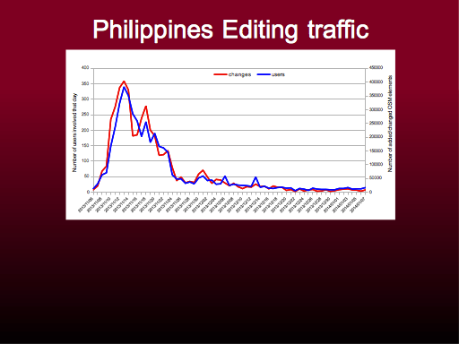
And here’s a brand new visualisation I created for you last night! The graph shows editing traffic over time. The time of the Typhoon is on the far left.So you can see we had a flurry of activity in the weeks following the disaster, which has tailed off.
Slide 21
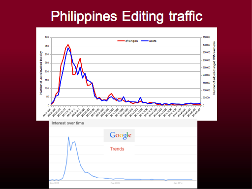
This corresponds very closely to the level on interest in the disaster in general. Google trends for the word “Typhoon”, shows the amount of press coverage and buzz about the disaster.
Unfortunately we only get lots of volunteer enthusiasm when these things are in the news, although I think this may also show we have a slightly longer attention span than the rest of the internet!
The spike isn’t a bad thing though. In fact in some ways we need to work on making the spike taller, but shifting it to the left as much as possible. The best and most effective response mapping happens as soon as possible after the disaster.
Imagine aid organisation using the data, by taking a snapshot from OpenStreetMap 48 hours after the disaster. The bulk of edits will not be picked up by them.
Slide 22
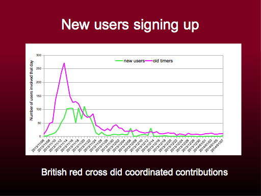
This shows new users in green. These are people who appear to have registered to edit OpenStreetMap during the crisis response (probably purely in order to take part in the crisis response).
This maybe shows that our “old-timers”, the more experienced OpenStreetMappers, were a bit quicker off the mark, responding soon after the disaster, while the new users came along when we ran events and showed them how to do it.
Slide 23
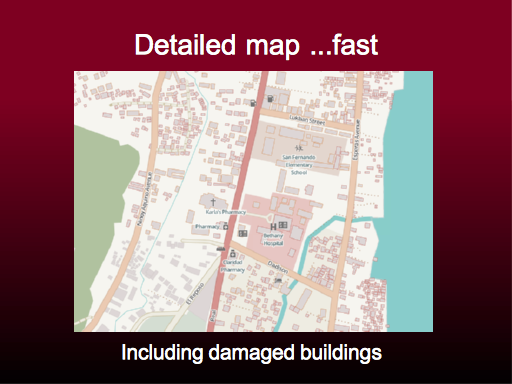
So the aim of this editing activity is to produce good detailed maps, fast.
Here we see the Humanitarian style. This is an interesting aspect of OpenStreetMap. There is a “standard” style, but there’s also many other custom styles produced from the same data. This style shows humanitarian related features.
Also shown here are some buildings with a red outline, where they are damaged. The community was able to do simple damage assessment in areas where we got hold of post-disaster imagery.
Slide 24
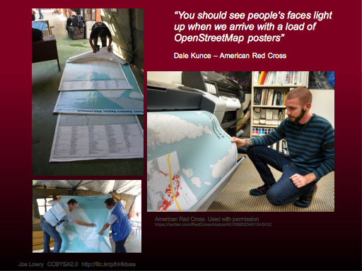
And here’s the maps in use in the Philippines. Various aid agencies decided to print map posters from OpenStreetMap.
The Red Cross can be seen here on the right doing some big printouts. They also got involved in actually contributing to the map. The British Red cross had a team of volunteers in their office here in the London, adding data following the same community processes as the rest of us.
In general we’ve seen more buy-in from aid agencies, and more up-front participation. Whereas in Haiti in 2010 they seemed to discover OpenStreetMap by surprise, with this response we see them going straight to OpenStreetMap, and pro-actively taking part in a process of improving the maps.
Slide 25
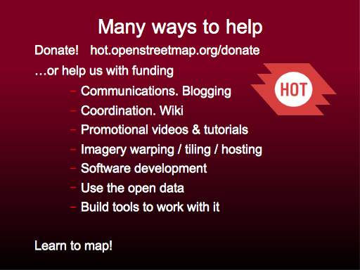
That’s it. I’ll wrap up by mentioning some ways anyone can help and get involved with H.O.T.
You can donate to HOT, and we’re actively seeking funding sources if anyone has ideas.
As with the wider OpenStreetMap project, there’s many other ways to help, and these range from very technical things like software development, GIS skills, geo-rectifying imagery data, through to things like blogging, making promotional videos, and coordinating the community.
But there’s one thing you really need to do first. A “gateway skill”. Lean to map! Learn to contribute to OpenStreetMap using the editor software. It’s supposed to be simple, and by learning this you’ll get a much better idea of how OpenStreetMap comes together. You’ll probably get a bit addicted, and you’ll clearly see the other ways you can help.
Slide 26
Thankyou very much! Check out the Humanitarian OpenStreetMap Team at http://hot.openstreetmap.org
Jump to slide:
1, 2, 3, 4, 5, 6, 7, 8, 9, 10, 11, 12, 13, 14, 15, 16, 17, 18, 19, 20, 21, 22, 23, 24, 25, 26
3 thoughts on “Typhoon Crisis Mapping ODI talk”